Clickable Card (Example 1)
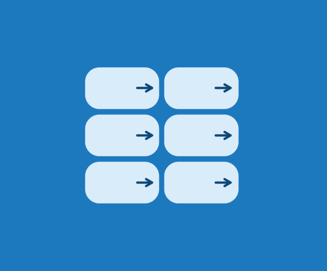
These cards don't have a visible button, but the card itself is clickable. You can tell the card is clickable by the arrow after the heading.
Clickable Card (Example 2)
When editing the cards, provide a URL link where the user indented to go, provide a Link Text (serves a purpose in case the clickable card doesn't work, and we need to default to a button) and click on a toggle Entire Card Clickable.
Card with a Button
You can also use cards with a button to send the user off to another location. Best practice is to use unique button labels with a hint where it will take the user.
Card with Links
You can also use links within the cards.
Media (Example 1)
Addition to descriptions, buttons, links within the cards, you can also add images or videos.
Media (Example 2)
Image selected to be on the top.

Media (Example 3)
Media can be rearranged depending on the desired outcome. You can select for the image to display on the top, left, or right within Media Alignment section. You can only use one card for the left or right alignment within the component.
Icons (Example 1)
You can also add icons that relate to your content.
Icons (Example 2)
Another example of icons.
Things to Consider
When designing cards for government services, it’s essential to prioritize clarity, simplicity, and accessibility. Using plain language ensures that services are easily understood by the general public, while clear action buttons help guide users to the next step without confusion. Additionally, visually distinct cards with easy-to-read text, icons, or images make it easier to differentiate categories and improve overall usability.
Accessibility
Ensure cards have proper contrast, readable text, and keyboard-friendly navigation.
Action Clarity
Buttons and links should be clear and easy to interact with.
Plain Language
Use plain language to make information clear and accessible. Avoid jargon, keep sentences concise, and focus on what users need to know at a glance.
User Testing
Regularly test with users to validate the effectiveness of card-based designs.