Component: Accordions

Summary

Accordions are a common User Experience (UX) pattern that can help reduce the amount of information presented to users.

While accordions can simplify long content pages and minimize scrolling, they can also diminish content visibility and increase interaction cost. It's best to use accordions for content-heavy pages where users will not need to access content under several accordions or there's a predictable pattern for what users can expect to find within the accordions.

What's an Accordion?

An accordion is a header that can be clicked to reveal or hide content associated with it.

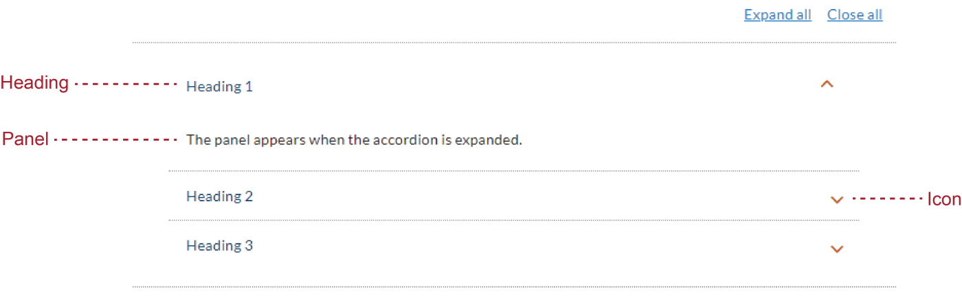
An accordion is typically made up of three elements:

  • Heading: A descriptive title that conveys the gist of the information contained within the accordion
  • Icon: A graphic symbol that signifies the state of the accordion and whether it will expand or collapse
  • Panel: The secondary content that is hidden when the accordion is closed
Image
 accordion is made up of three elements: heading, icon, panel

Accordions are a type of progressive disclosure. The heading provides a concise overview of the topic. The panel is hidden by default, offering supplementary details to those who are interested. An accordion empowers people to choose what to read and what to skip.

Example of an Accordion

Below is an accordion example with a heading and body paragraph displays after its expanded. When adding accordions, you can choose to toggle to display 'Expand/ Close All', to make it easier for the user to expand and collapse the information with ease. 

Heading 1

The panel appears when the accordion is expanded.

Heading 2

The panel appears when the accordion is expanded.

Heading 3

The panel appears when the accordion is expanded.

Benefits of Accordions

Accordions are versatile and help users navigate through page content by organizing information in a logical manner and structuring information about a single topic, concept, product, or article. The following are key advantages of accordions:

  • Reducing clutter: Displaying information one section at a time lowers users' cognitive load.
  • Minimizes scrolling: Helps reduce the length of a page while keeping key information visible; allows a wider range of topics to remain accessible without excessive scrolling.
  • Convey an overview of the page: Serves as a concise overview of webpage content; helps users quickly identify relevant information and navigate efficiently without unnecessary guesswork.
  • Improving scannability: Makes web content easier to scan by breaking it into sections with clear headings; allows users to quickly find and understand key information.
  • Direct access to content: Provides quick access to specific information without needing to scroll through all preceding content, which is especially useful for users seeking particular details.

Usability Concerns to Consider

Despite their ability to effectively organize information and simplify long, complex pages, the use of accordions is not always recommended. Here are some of their drawbacks and reasons we might consider another layout or an editing content to better fit the use of accordions:

  • Fragmented access to information: Can disrupt the user experience when information is written across multiple sections; we minimize this fragmentation by allowing users to open more than one accordion at a time.

  • Increased interaction cost: Each accordion requires a click to open or close.  

  • Compromised discoverability: Compromises the discoverability of the collapsed content, especially if headings are not concise or clear.  We recommend keeping content within accordions short, headings concise, and if there is anything urgent or important, to consider a different layout.  

  • Accessibility considerations: For partners who are developing accordions, consider additional design considerations to ensure accordions are usable and accessible via keyboards and with screen-reader.  

  • Difficulty with printing: If users do not have the appropriate accordions open, the content may not print.  For a long list of accordions, we recommend authors turn on the "Expand all / Close all" functionality.  

When to Use & When to Avoid

Deciding whether to incorporate accordions into your design requires careful consideration of the tradeoffs and benefits involved. Start by considering:

  • Your audience's needs: What are the common and critical use cases? Do accordions help users find answers to their questions more efficiently?
  • The specific content you are presenting: Does the content structure lend itself well to accordion-style presentation? Are there alternative navigation tools or design patterns?

When to Use

Use accordions to streamline content for focused information, step-by-step processes (consider our "step by step" component for instances when that makes sense), independent sections, and mobile optimization.

  • Limited information: Use accordions when users need to focus on a few pieces of information, which helps them avoid distraction and efficiently access only the relevant content.
  • Step-by-Step processes: Employ accordions for logical, step-by-step tasks to present information pertinent to each step while minimizing distraction from irrelevant details; or use our step by step component
  • Independent sections: Apply accordions when information in each section is independent; ensure headers for each section are clear that accordions are presenting a grouping of related content.
  • Mobile optimization: Use accordions to manage long content and reduce page length on small screens, enhancing content prioritization and readability.

When to Avoid

Avoid accordions when users need all content visible, on pages with minimal content, for deep hierarchical structures, when content is hard to summarize, and for continuous reading experiences.

  • Full content required: Avoid accordions when users need access to all content to find answers, as showing everything at once facilitates easier access to essential information. If content is long, we recommend reworking or rewriting content and break content up with subheads and bullet points instead of hiding content within accordions.
  • Minimal content: Refrain from using accordions on pages with little content as they can make the page appear empty and potentially cause users to abandon it.
  • Deep hierarchy: Skip accordions for content with deep hierarchical structures as they can be confusing and make it difficult for users to navigate through multiple sublevels.
  • Scattered content: Avoid accordions for content that is hard to summarize; if a concise or clear heading is not possible in summarizing content, it can lead to confusion and ineffective communication of key information.
  • Continuous Reading: Do not use accordions for content requiring a seamless reading experience such as with news articles or narratives; accordions can disrupt the flow and context. 

Best Practices

If you choose to incorporate accordions into your design, keep the following guidelines in mind:

  • Ensure that the heading accurately reflects the content within the panel. A clear, descriptive heading is key to enticing users’ interest in exploring the detailed content inside the accordion. The labels of accordions can greatly impact the findability, discoverability, and accessibility of your content.
  • Avoid hiding any crucial information within the collapsed panels. Essential information should be presented outside of accordions to ensure it is readily available and not easily overlooked. By doing so, you prevent critical content from being buried and ignored.

Resources

Learn More

To learn more in depth about best practices for accordions on desktop, visit the NNg website for UX guidelines.

For Developers

You can visit Storybook for Inherited CSS Variables and Twig Variables for the accordion component.