Typography

Summary

Typography plays a vital role in creating clear, accessible, and user-friendly web experiences for court users.

The typography on our websites is chosen with inclusivity and clarity in mind, ensuring all users can easily read and understand the content. From accessible font sizes to consistent type hierarchies, our typography guidelines prioritize legibility for diverse audiences. Thoughtfully chosen typefaces enhance the overall user experience, balancing the website’s professional tone with modern functionality. These guidelines establish a cohesive visual identity and support consistent communication across the site.

Typography

JCC websites need clear and consistent headings, highly legible body paragraphs, clear labels, and easy-to-use input fields. Our default typefaces are designed for legibility and can adapt to a variety of visual tones.

The fonts in the design system are Lato (sans-serif) and Lora (serif), both of which are open source, readily available google fonts.  Lato is the predominant font in the latest component library; however, Lora can be found on sites with previous versions of the design system.  

Image
Typography for elevated design

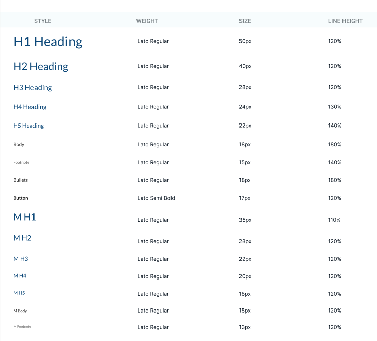
For notes on proper heading usage, visit our section on Accessibility: Headings.