Icons are visual symbols that help users quickly understand actions, content, or navigation without relying solely on text.
When used effectively, icons enhance usability by providing clarity, scannability, and visual appeal. However, they should always support—not replace—text labels to ensure accessibility and comprehension.
What Are Icons?
Icons are small graphical representations of actions, objects, or concepts used in digital interfaces. They help users recognize functions at a glance, making interfaces more intuitive and visually engaging. Icons can represent everything from navigation elements to system statuses and interactive features.
Examples of Icons
Navigation Icons – Search, menu, breadcrumb arrows - these are typically set within the design system
Action Icons – Download, share
Status Icons – Error, success, warning, loading (i.e. Alerts that are also set in the design system)
Service-Specific Icons – Location, language translations
Iconography
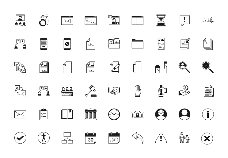
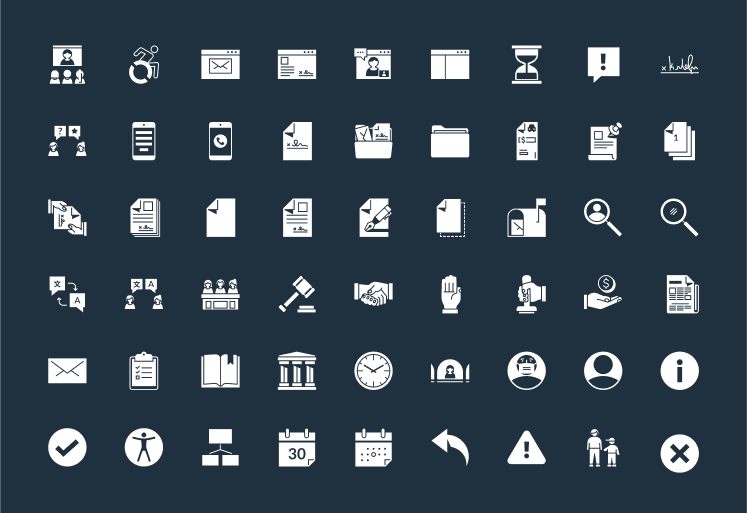
Icons are used to help simplify complex ideas so that our message to users can be translated easily. The set of icons presented were specifically designed for the Judicial Branch. They can be seen throughout our ecosystem of sites, particularly where self-help information or topics need to be illustrated. Imagery for a "clerk's window" or "jury service" might otherwise be difficult to find. Justice partners can visit our GitHub repository to download icons in SVG format for use on court digital applications and services.
Image
Image
Benefits of Icons
Improves Usability - Icons provide a quick way to understand functionality without needing to read long descriptions.
Enhances Aesthetics - A well-designed icon set creates visual consistency and improves the overall look and feel of an interface.
Saves Space - Icons help compactly represent functions, which is especially useful in mobile and small-screen environments.
Increases Accessibility - When paired with text labels and designed with proper contrast, icons improve navigation for all users, including those with visual impairments.
Usability Concerns to Consider
Ambiguity – Users may misinterpret icons if they are not widely recognized or lack supporting text.
Cultural Differences – Some icons may have different meanings across cultures, leading to confusion.
Scalability – Icons should be legible at different sizes, especially on small screens.
Contrast & Visibility – Ensure icons meet contrast requirements for accessibility and remain visible on different backgrounds.
When to Use & When to Avoid
When to Use
To represent common actions users recognize (e.g., a magnifying glass for search).
When paired with a label for clarity.
When space is limited and an icon can replace long text descriptions.
When to Avoid
When an icon’s meaning is unclear without a label.
When relying on icons alone for critical actions (always include text for accessibility).
When icons add unnecessary complexity to the interface.
Things to Consider
Pair Icons with Text – Unless universally understood, icons should always have labels.
Use a Consistent Style – Icons should match in size, line weight, and design style for uniformity.
Ensure Accessibility – Use ARIA labels, tooltips, and adequate contrast for visually impaired users.
Test with Users – Conduct usability testing to confirm icons are intuitive and meaningful.